Danny Malter
VP Data Science and Machine Learning - Intellicheck
M.S. in Predictive Analytics - DePaul University

Me
Malter Analytics
GitHub
LinkedIn
YouTube Channel
Kaggle
Other Work
Into to Python Course
General Assembly
AriBall
Media
Built In
Analyzing NHL Gameplay Data
This analysis will explore how to use and analyze NHL gameplay data. All data is provided from statsapi.web.nhl.com/ for the 2019-20 NHL season through the date of this posting. All code is provided on my personal GitHub site.
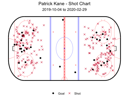
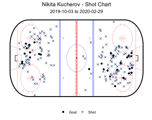
The below images show shot charts for both Patrick Kane and Nikita Kucherov. Goals are represented by the dots and shots are represented as an ‘x’. You can play around with these charts through an interactive application here.
Given that Kane is a right wing, it shouldn’t come as a surprise that most of his shots are from right of the goal, but charts like this can start to show deeper information by answering questions about Kane’s success rate from the right and left sides of the goal.
Although this plot can be informative to players and how they might strategize, it doesn’t show how many shots ricocheted off of the goalie and resulted in a team goal. With that being said, we can still find interesting patterns from analyzing this data. For example, Kane shoots and scores from both sides of the net, but when comparing him to another top scoring right wing, Nikita Kucherov, we see that Kucherov shoots the vast majority of his shots from the right side only. Teams can start to use this information in planning for how to defend against certain players.
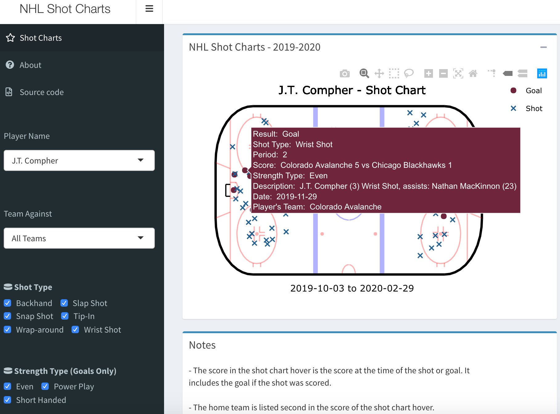
You can play around with the shot charts here for any player in the NHL. This interactive application provides a lot more information for each shot and provides the ability to filter data based on things such as the period, team against, shot type, etc.
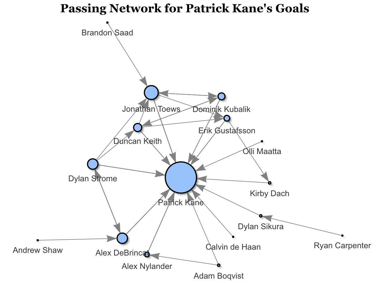
We can also use network graphs to show who is involved the most when a given player scores. In this case, we’re looking at a network graph for Patrick Kane’s goals. The size of the bubble represents the player’s involvement in Kane’s goals and the arrows represents a pass from one player to another based on direction of the arrow.
For all of Kane’s goals, Jonathan Toews has the most involvement. It’s important to note that in hockey two players can have an assist, so we can see connections from multiple players leading to Kane. For example, one specific goal occurred from Brandon Saad (top left) to Jonathan Toews to Patrick Kane. Another one of Kane’s goals was by a pass from Jonathan Toews to Dominik Kubalik to Patrick Kane for a goal.
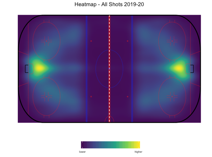
Finally, we have a heat map for every single shot taken to date in the 2019-20 NHL season. The bright yellow area shows the highest density of where shots occur from, which to no surprise is right in front of the net. However, it’s interesting to see that as players take shots further from the net, it’s either directly in front of the net or at about a 45-degree angle.