Danny Malter
VP Data Science and Machine Learning - Intellicheck
M.S. in Predictive Analytics - DePaul University

Me
Malter Analytics
GitHub
LinkedIn
YouTube Channel
Kaggle
Other Work
Into to Python Course
General Assembly
AriBall
Media
Built In
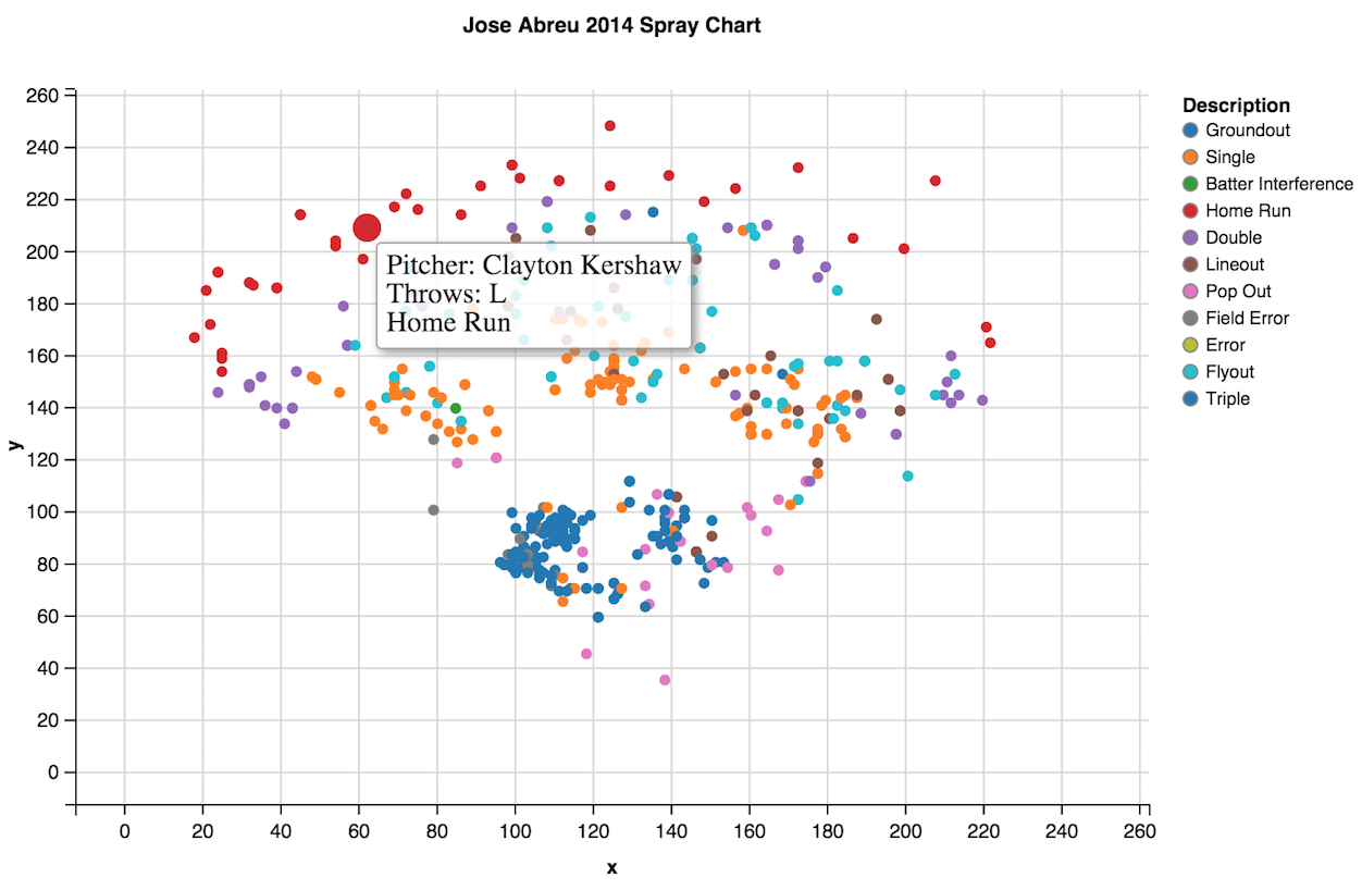
Create your own MLB Spray Charts
This post is an example of scraping XML data files from mlb.com using the pitchRx package to create your own spray charts.
Click to see the full interactive Shiny app.
https://danmalter.shinyapps.io/Spray-Chart/
- Load in the required packages
library(ggvis)
library(dplyr)
library(ggplot2)
library(RSQLite)
library(pitchRx)
- Download MLB Gameday data from mlb.com. Downloading a full season’s worth of data may take a few minutes.
files <- c("inning/inning_hit.xml", "players.xml", "miniscoreboard.xml")
my_db <- src_sqlite("MLB2014.sqlite3", create = TRUE)
scrape(start = "2014-03-30", end = "2014-09-30", connect = my_db$con, suffix = files)
- Merge together the locations table to produce a master table. In this case, I filter just to look at the spray chart of Jose Abreu.
locations <- select(tbl(my_db, "hip"), des, x, y, batter, pitcher, type, team, inning)
locations <- as.data.frame(locations, n=-1)
locations <- locations[!duplicated(locations),]
names(locations)[names(locations) == 'batter'] <- 'batter.id'
names(locations)[names(locations) == 'pitcher'] <- 'pitcher.id'

batters <- select(tbl(my_db, "player"), first, last, id, bats, team_abbrev, rl)
batters <- as.data.frame(batters, n=-1)
batters <- batters[!duplicated(batters),]
batters$full.name <- paste(batters$first, batters$last, sep = " ")
names(batters)[names(batters) == 'id'] <- 'batter.id'
batters <- batters[,-c(1,2)]
names(batters)[names(batters) == 'rl'] <- 'batter.rl'

# I have already created a new column with the full name, so I delete the first two columns that contain the first name and the last name
batters <- batters[,-c(1,2)]

players <- as.data.frame(players, n=-1)
names(players)[names(players) == 'id'] <- 'player.id'

# Get the pitcher's throw type
players <- merge(players, batters, by.x="full_name", by.y="full.name")
players <- players[,-c(3:5)]
names(players)[names(players) == 'rl'] <- 'pitcher.rl'

# If scraping the whole season, you will need to take out non-mlb regular season games.
batters <- batters[ !grepl("AL", batters$team_abbrev) , ]
batters <- batters[ !grepl("NL", batters$team_abbrev) , ]
batters <- batters[ !grepl("VER", batters$team_abbrev) , ]

# Merge the batters and location tables together.
spraychart <- merge(locations, batters, by="batter.id")
spraychart <- merge(spraychart, players, by.x="pitcher.id", by.y="player.id")
names(spraychart)[names(spraychart) == 'full.name'] <- 'batter.name'
names(spraychart)[names(spraychart) == 'full_name'] <- 'pitcher.name'
names(spraychart)[names(spraychart) == 'des'] <- 'Description'

# Subset to only look at Jose Abreu's spray chart
spraychart <- subset(spraychart, batter.name=="Jose Abreu")
Create a ggvis tooltip to be used when hovering over points.
# Create ggvis tooltip
  spraychart$id <- 1:nrow(spraychart)

  all_values <- function(x) {
    if(is.null(x)) return(NULL)

    paste0("Pitcher: ",
           spraychart$pitcher.name[x$id],
           "<br>",
           "Throws: ",
           spraychart$pitcher.rl[x$id],
           "<br>",
           spraychart$Description[x$id]
    )
  }
Create a ggvis interactive graph of the coodinates of each outcome.
spraychart %>%
  ggvis(~x, ~-y+250) %>%
  layer_points(size := 30, size.hover := 200, fill = ~Description, key:=~id) %>%
  scale_numeric("x", domain = c(0, 250), nice = FALSE) %>%
  scale_numeric("y", domain = c(0, 250), nice = FALSE) %>%
  hide_legend("stroke") %>%
  add_tooltip(all_values, "hover") %>%
  add_axis("x", title = "x") %>%
  add_axis("y", title = "y") %>%
  add_axis("x", orient = "top", ticks = 0, title = 'Jose Abreu 2014 Spray Chart',
           properties = axis_props(
             axis = list(stroke = "white"),
             title = list(fontSize = 12),
             labels = list(fontSize = 0)))
The full animated application can be seen here.
comments powered by Disqus